Efficacy
If effective, every webpage on sfhsa.org will be able to answer a problem someone is trying to solve.
An effective public facing website for the Agency should deliver information and services to diverse users on multiple digital platforms (mobile, desktop, tablets, etc.) consistently, quickly and easily. Clients, Community Based Organizations(CBOs) and HSA staff will be able to find up-to-date and reliable information; communicate with the Agency as needed, complete applications; and share information and updates through social media.
A successful HSA digital presence creates benchmarks to know that it is meeting user needs. Measuring if a website is successful requires knowing how the website is being used, where it is being used, what problems users are trying to solve and understanding the roadblocks on the website preventing users from accomplishing their goals.
To understand the efficacy of the current HSA website, we utilized a combination of quantitative and qualitative metrics.
Quantitative Metrics: Data
Data analysis conducted through Google Analytics revealed what people are using the sfhsa.org for and how successful they are while on the website. Other factors included: what pages people were accessing, how they were utilizing search, whether they were using a mobile device or a desktop computer and how many pages they visited. By using this data, the agency can set benchmarks to start planning for the future.
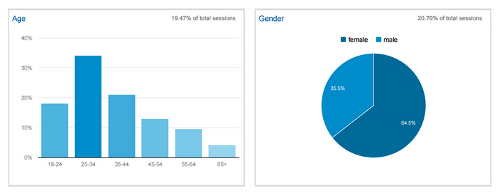
Website User Demographic
(metrics from July 2015–August 2015)
Age identifies users by six categories: 18-24, 25-34, 35-44, 45-54, 55-64, and 65+. Gender identifies users as either male or female.
Current Website Usage Data
(metrics from August 2014–August 2015)
Only 10% of Users Enter the Website Through the Homepage
Why It Matters:
Users are finding their way to many pages of the website (a good thing), but it puts an emphasis on ensuring website content is comprehensive and easy to access from any page.
How To Fix It:
Enhance the availability and design of content regardless of how users enter the website. Refine all content pages to act as traditional landing pages that contain all the information needed about their topic. See HSA Recommendations and Next Steps for Draft Wireframes.
45% of Visits are from Mobile Devices
Why It Matters:
The current website is not optimized—designed to make the best use of—displaying on mobile devices. This hurts the user experience, functionality and search engine effectiveness while trying to use sfhsa.org with a smartphone.
How To Fix It:
Place an emphasis on all website tools and content being accessible and easy to use regardless of device.
Develop a new website design that is responsive, with an adaptive layout that adjusts to be optimally used on different devices.
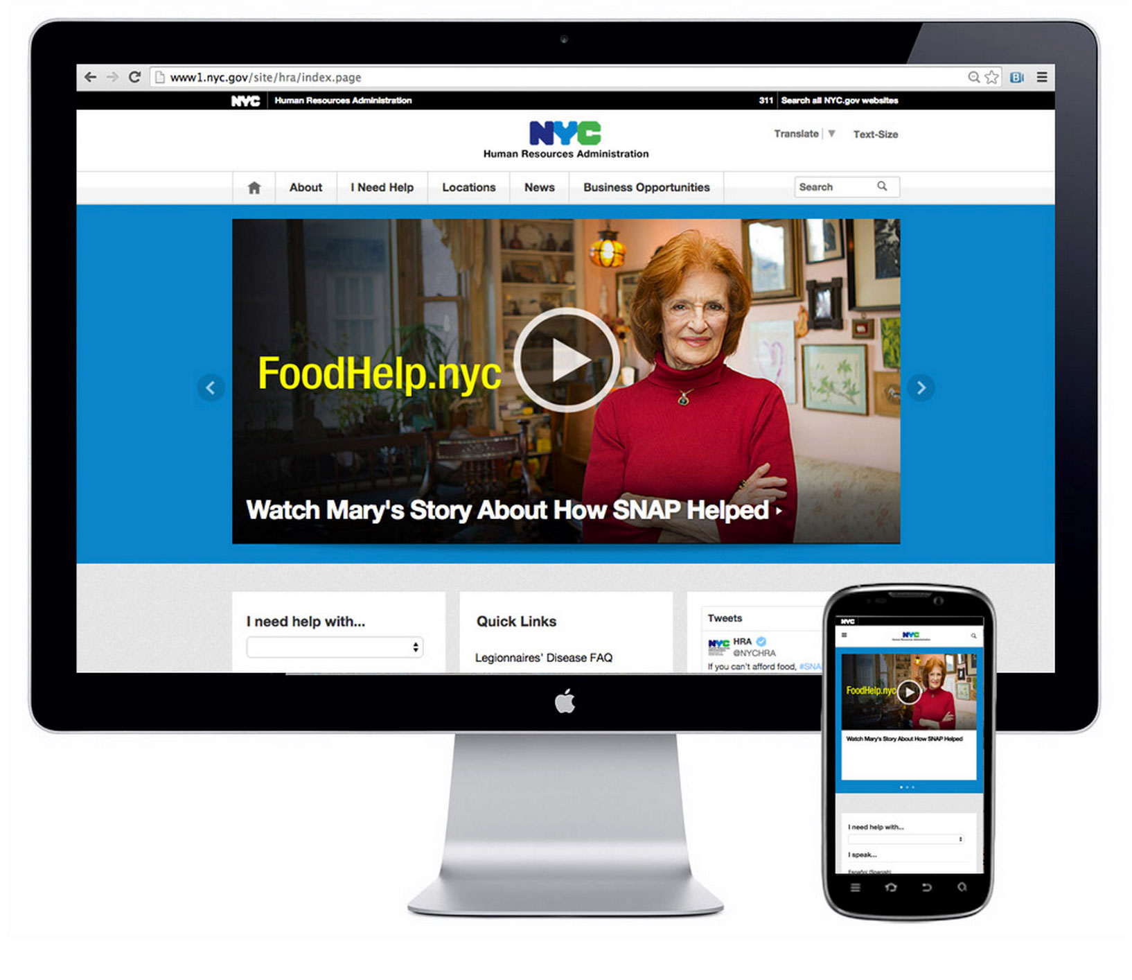
Example:
Visiting New York City’s Human Services website on a computer or a phone users are presented with different layouts. The computer layout shows larger images and more content to navigate, while the mobile view displays smaller images in addition to a layout that is more simple and prioritizes a limited number of links and navigational paths.
On-site Search Used 261 times of 31,000 Sessions
Why It Matters:
While users are accustomed to using the Search Tool for items they cannot find, the current search functionality on sfhsa.org is rarely used. This indicates that users are having a hard time using the tool or are not receiving the results they are looking for.
How to Fix it:
Update website user experience and design to make search functionality more apparent and accessible by using Google Search.
Example:
We entered a search for the term “San Francisco Food Assistance” in the sfhsa.org search bar and on Google. The top five results from the sfhsa.org search bar did not include any programs from the agency. On Google, HSA appeared in the top three results.

Search results from sfhsa.org

Search results from Google.
Variants of “Forms” Was the Most Popular Search with 143 of 272 Searches on sfhsa.org
Why It Matters:
Users are attempting to access website information using different terms, with few obvious groupings (suggesting the search box is their “last resort”). Users search for forms the most, suggesting they were having trouble finding the right form on the website.
How To Fix It:
Add a form finder functionality to an improved web presence. Increase the ease of use for search functionality (by providing quicker common answers or in-line suggestions that pop up as people are typing, similar to Google).
66% of Users Look at One Page and Leave (Bounce Rate).
Why It Matters:
The bounce rate of a website describes how often users visit only one page before leaving the site without clicking on anything. The high bounce rate for sfhsa.org users means they either found immediately what they needed or couldn’t find it. An additional engagement through the site could be helpful to users in either instance.
How To Fix It:
Make it easier to find applicable content and encourage accessing multiple pages when they visit any page on sfhsa.org.
Determine certain website behavior as baseline metrics to create benchmarks for website improvements. For example, now that there is a metric for the bounce rate on sfhsa.org, it is possible to test improvements to the website’s navigation or search function to see how different improvements lead to a reduction in the bounce rate.
Qualitative Metrics
Qualitative data is information about experiences that cannot be counted in numbers and is often paired with quantitative (numeric) data to show a more complete picture about a website’s use.
For example, the bounce rate on sfhsa.org meaures the number of times someone visited the website and left after viewing one page. To understand a broader perspective on what that number means, it was paired with a short, pop-up, survey placed on sfhsa.org to reveal how people experienced the website and how successsful they felt the website was for their needs. Other qualitative data about users’ experiences with sfhsa.org was captured during three community forums; two specifically for clients of HSA and one for community based organizations who partner with the Agency.
Pop-Up Survey
For five days, a two-question survey was placed on sfhsa.org and appeared as a pop-up window at the bottom of the screen while people were on the website.
Question 1: “Did You Find What You Need?”
166 people answered the first question; with 54% responding “yes” and 46% responding “no.” However without the answer to the second question, we are limited to the conclusions we can draw.
Question 2: “What are you looking for?”
42 people completed the second question (They had to complete the first one to get to the second). 34 of these people responded “No” to being able to find what they needed from the website, including: jobs, housing, General Assistance (GA), In Home Support Services (IHSS), HSA contact information, applications, and making appointments.
8 people completed both questions and were able to find what they needed. However, no clear pattern emerged as to what they were looking for.
Community Forums
HSA clients were asked in two community forums, about how they were currently using sfhsa.org, what is missing from that experience and what they would like to see in a new sfhsa.org. They feedback can be grouped in three areas:
-
Add a directory of valuable resources they need, add maps and contacts: easy accessibility.
-
Separate in a visible way each service.
-
Include an HSA tech support service group, showing clients how to use these services online.
Community organizations that partner with HSA were asked similar questions as clients. Their responses are also grouped into three areas:
-
Be able to apply (online) and know the status and final outcome of the process.
-
Clarify to clients who the providers are that are delivering services–there are no links to vendor websites from HSA website.
-
Technology is not the only answer; HSA needs live people communicating.
Why it Matters
A successful sfhsa.org cultivates trust between the audience and the agency. Clients and citizens expect HSA to have a digital presence that they can turn to in order to find reliable information; understand the process of using different services; communicate with the agency, and complete applications. If the website lives up to these expectations users will trust the website as a place to turn to when they need assistance.
The pop-up survey data indicated that while some people are having success using the website, others face failure when doing similar searches. One individual was able to find “housing for homeless families,” but another was unable to find “Housing for me and my 2 children.” Likewise, one visitor to the website was able to find “job listings,” while people who searched “job description for public conservator,” and “jobs in California,” were unsuccessful. The community forum data brought to light problems users are trying to solve on sfhsa.org and the roadblocks preventing them doing so.
How To Fix It:
As changes are made to the site, it is important to keep track of how these improvements impact the effectiveness of HSA digital information and services by using quantitative and qualitative data. Regularly measuring how users are experiencing sfhsa.org, the traffic on the site and working closely and repeatedly with users will give HSA the data and the confidence to know the website is working at its best.