Digital Strategy Report Summary
Intro
“The website is not utilized the way it should be for us. We just haven’t paid attention to the design of it. We haven’t focused on who we’re trying to reach, serving, the people in communities or even staff. I think we haven’t looked at essentials for the website serving people: accessibility, font, color, all of those elements you need for those populations we serve.” - Department of Aging and Adult Services (DAAS) Executive Leadership
The San Francisco Human Services Agency (HSA) is a lifeline for 23% of San Franciscans, serving over 200,000 unique persons seeking food assistance, health care, elder & child care, job training, and other essential social services. Sfhsa.org serves as the proverbial front door to the agency with more than 30,000 unique visits to the website each month. The public facing website has the potential to provide information and services in an accessible, well curated, effective way with the utmost dignity and respect for the client experience.
Our Process
We’ve talked to HSA representatives from The Department of Aging and Adult Services (DAAS), The Office of Early Care and Education (OECE), The Department of Human Services (DHS), including Information Technology (IT), Family and Children’s Services (FCS), Internal Affairs, and Executive Leadership. We’ve engaged HSA clients and Community Based Organizations (CBOs). More details can be found here in our understanding of the Agency’s Current Landscape.
The overwhelming response to sfhsa.org has been: > “The website is not suiting the agency or client needs. What can we do to fix it?”
If effective, every webpage on sfhsa.org will be able to answer a problem someone is trying to solve.
To understand the efficacy of the current HSA website, we utilized a combination of quantitative and qualitative metrics. Qualitative data is information about experiences that cannot be counted in numbers and is often paired with quantitative (numeric) data to show a more complete picture about a website’s use. More detail can be found in Efficacy.
Current Website Usage Data
(metrics from August 2014–August 2015)
Google Analytics on sfhsa.org:
- Google has indexed 3,346 pages on sfhsa.org
- 132 pages get 98% of all traffic in the last year
- Only 10% of users enter the site through the homepage
- 45% of visits are via mobile devices
- 66% of users look at one page and leave
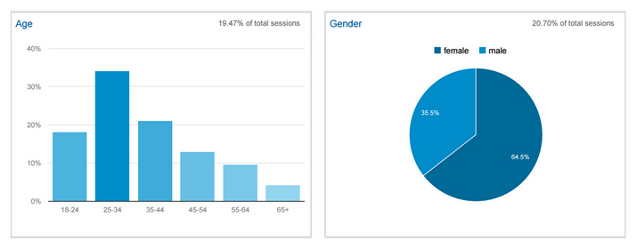
Website User Demographic
(metrics from July 2015–August 2015)
Community Forums
We held 3 public community workshops with 47 HSA clients and 6 Community-Based Organizations (CBOs). Participants shared how they were currently using sfhsa.org, what is missing from that experience and what they would like to see in a new sfhsa.org.
Client Feedback:
Make the website easier to use. Make HSA staff communications more accessible. Include an HSA tech support service group, showing clients how to use these services online.
Community-Based Organization Feedback:
Make it easy to apply (online) and know the status and final outcome of the process. Make the website solution-oriented, customer-focused, and user-friendly. Improve collaboration: sharing information between agencies and with partners.
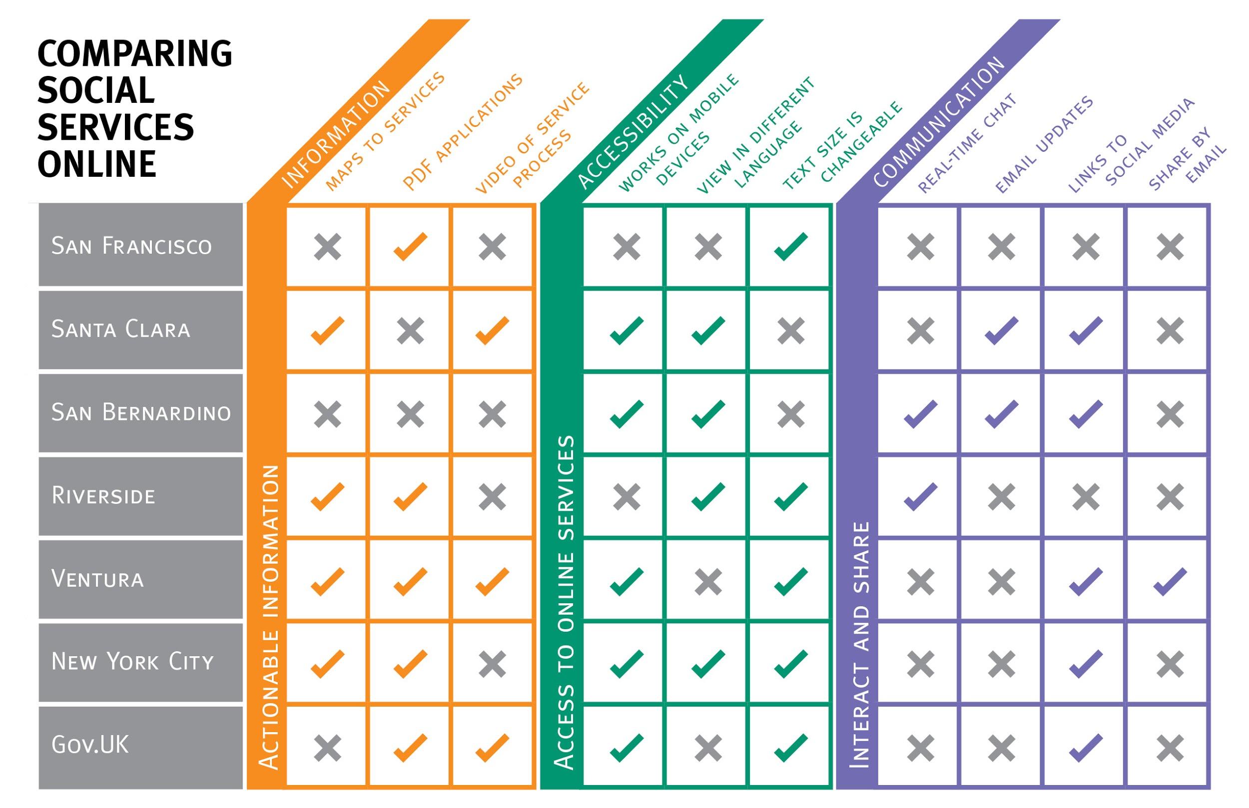
Comparative Analysis
Comparative analysis was conducted to evaluate sfhsa.org and other Human Service agencies that provide social services online.
Recommendations
Core Requirements
Based on the synthesis of the findings, we recommend a number of steps that can be taken to build a strong foundation for the public facing website. Core requirements will better the functionality of the website. More detail can be found in Recommendations and Next Steps.
The new site must be:
- User-Centered
- 508-Compliant
- Responsive
- Multilingual
- Built with powerful and effective Search in mind, far superior to the current site.
- Anchored in an actionable and sustainable Content Strategy
- Marketed via an effective Social Media Strategy
- Built with Website Transparency in mind
- Incorporates Feedback Loops
- Shareable
The New Website: Information, Knowledge, Resources, Tools-not Transactions (Yet)
We are recommending that the new website is an informational content platform with an eye towards creating transactions in the future (allowing clients and others to complete tasks/receive services through sfhsa.org). The website should curate sets of experiences, enabling users to easily journey through HSA information, programs, and resources. The visitor should be able to easily find the information she needs and locate links to other digital transactional tools, which reside off the website. Many of those tools exist today and more purpose-built transactional systems may exist in the future.
HSA Website “Product Ownership” Resides in Three Scenarios
The current content management situation at HSA: someone gets trained to update the site. They leave. No one updates the site.
In the envisioned future, content management at HSA is centralized with close partnerships between the PIO Office, IT and Programs across all three scenarios. The website ownership is centralized into a Website Product Owner who manages the website and all training materials. The Website Product Owner can update any page on the site, create new pages, and change information architecture. The Owner can also create restricted user accounts for Program officers. Program officers are given access to training materials (so they can easily learn to update the site) and to make updates to a restricted set of pages related to their program. Programs are responsible for creating and updating their own content.
Based on HSA staff interviews and our understanding of the website needs, we developed three scenarios for website content and maintenance. In the document linked below we offer a detailed analysis for Website Product Owner as well as for supporting teams and roles. More detail can be found in HSA Website Ownership Analysis.
Wireframes
The following wireframes (sketches for improving how sfhsa.org is designed) are based on the identified immediate needs of the website. (Note: These layouts are designed so that when a user enters a page from a computer the top half of each page is visible. The bottom half of each page can be viewed by vertically scrolling down the page.)
Navigate by Program Topic: Option 1 for the Homepage (pdf)
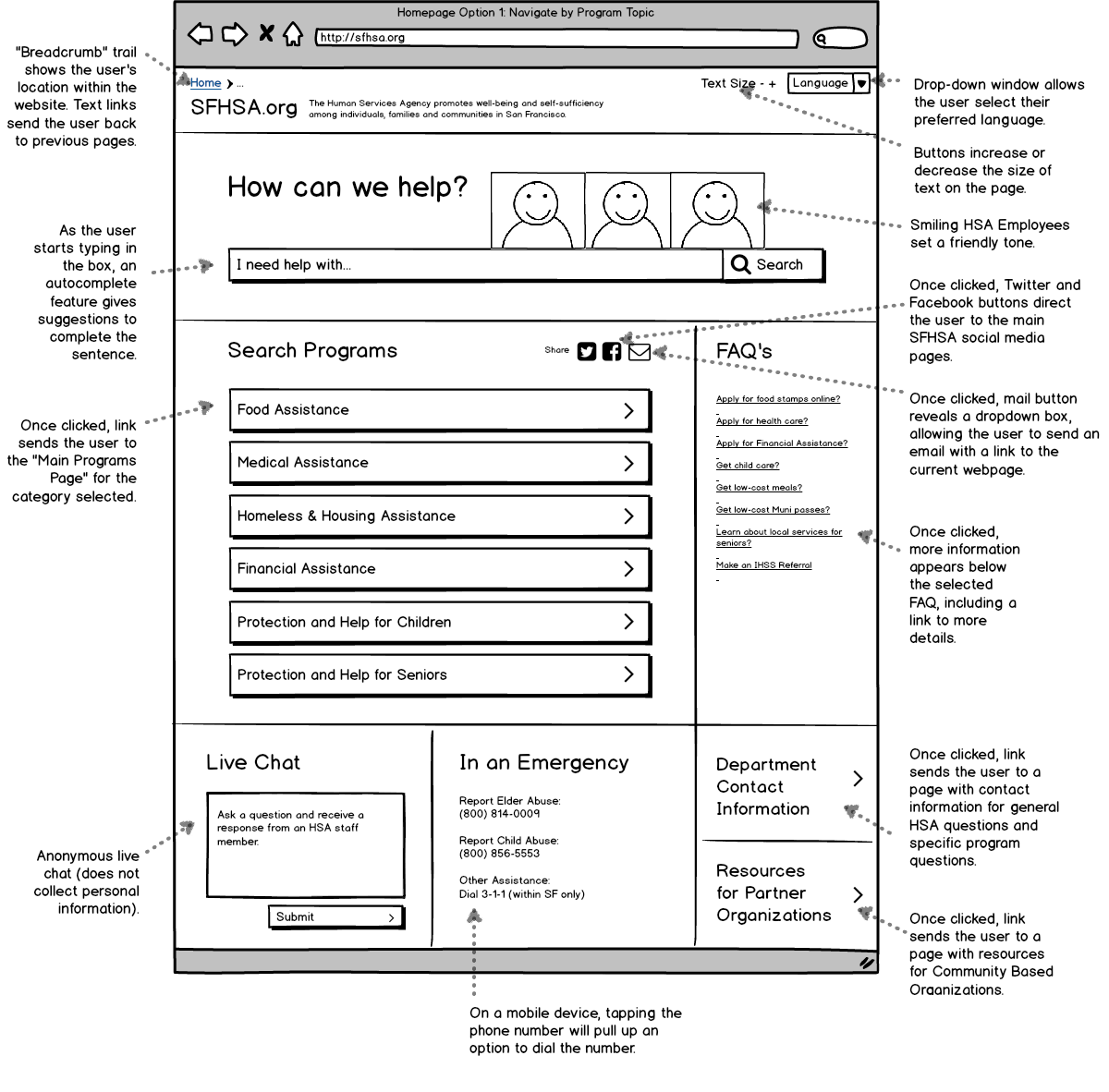
The above layout highlights searching by topic of services that a user may need.
When navigating the page, the first thing the user is directed to is a contextual search box that asks the question, “How can we help?”. Prominently featured below is a list of buttons that organizes program content by topic. Clicking on a topic button brings the user to a Program Category Page showing all the different programs that fall within that topic.
Navigate by Audience: Option 2 for the Homepage (pdf)
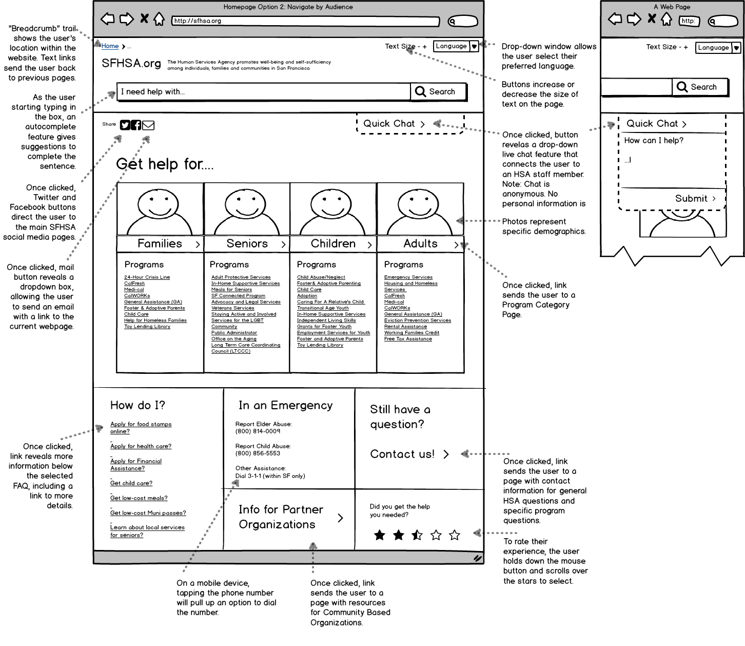
The above layout highlights searching for programs by the population the services are intended to reach.
The primary section on the page displays photographs of diverse people representing the demographics that different HSA services are targeting. Clicking on the main text under a photo sends the user to a Program Category Page. Each Program Category Page displays different programs that relate to that demographic. Below the photographs, users can also navigate within each demographic category and be directed to a Specific Program Page that contains individual program content.
Program Category Page: Secondary Page (pdf)
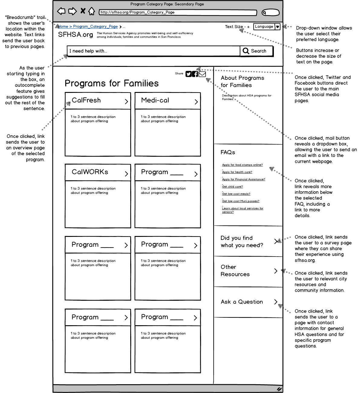
Each Program Category Page acts as an umbrella page showing all the programs that fall under that topic.
Each program on this page has a short description and a link to a Specific Program Page containing a more detailed overview about the individual program.
Specific Program Page: Tertiary Page (pdf)
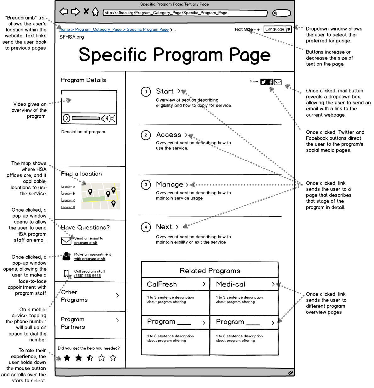
A Specific Program Page contains an overview about one individual program.
This page gives the user an overview on using the services of that program from start to finish, including how to maintain services. Clicking on a program stage sends the user to a detailed guide of that part in the process. Secondary information on this page includes a video with an overview of how the program works, and brief descriptions of related programs.